 Happily Ever After
Life in The Rural Retreat with a beautiful wife, three cats, garden wildlife, a camera, a computer – and increasing amounts about running
Earlier posts can be found on Adventures of a Lone Bass Player, where this blog began life. Recent entries can be found here.
A Presentational Problem
by admin - 16:28 on 14 March 2011
It was a snowy weekend, then a damp, slushy one. The last evidence melted today but the light was consistently rubbish as far as garden bird snappery was concerned.
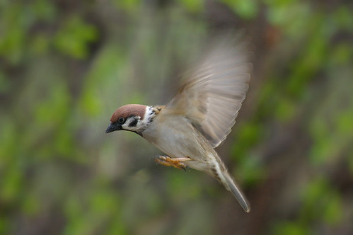
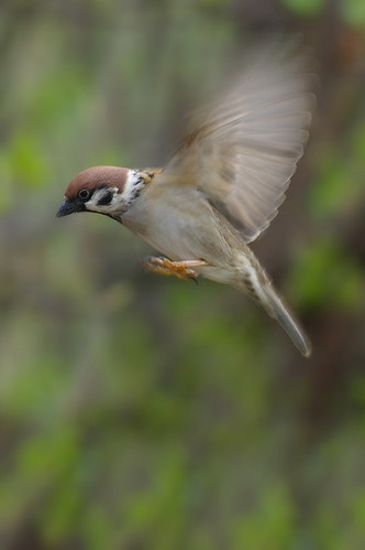
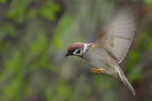
I was lucky enough to catch another sparrow in action – very lucky, for the only decent shot was the last one taken before my batteries died. Nothing of worth was captured after they were replaced.
However, the snap left me in a quandary: what is the best way to present my feathered subject? Vertical? Horizontal? Centred? Placed right? The only way I didn't try was in a square as I've used that format already.
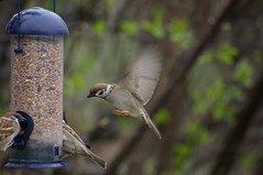
I realise that sight of the untouched original, complete with feeder, will shatter some illusions, but so be it. Photoshop does have its place and this is one of them. So tell me which you think looks best – I can't decide.
And if you're wondering why I don't chop down the ugly black branch that slashes through the picture behind the sparrow's tail, just outside the frame is the fat-filled coconut that hangs from it, and which is far too popular with woodpeckers to risk moving.
Life is compromise.
Add your comment


